Logos are a great way to brand your business. They are easy to create, look professional and work well on social media platforms to bring your brand into the spotlight.
However, choosing the right colours for a logo makes a lot of difference. Some businesses prefer to use bright and appealing colours, while others choose soft and subtle colours to make their logo stand out.
If you are planning on creating a logo but are unsure what colours to use, here is a guide to help you.
Different Colours And Their Examples
Blue Logo
Blue is associated with trust, peace, order, and loyalty. As one of the most vibrant colours, it is often associated with trust, peace, order, and loyalty.
However, using a very calming shade of blue helps people feel uplifted and relaxed, resembling the calm waves of the water. Brands like Nike use different shades of blue to make their logo stand out.
Moreover, blue is a popular choice of colour for logos because of its wide range of uses across different industries.
Whether you are a clothing brand or part of the automobile industry, blue works well for a myriad of industries and audiences.
Blue Logo Examples
Red Logo
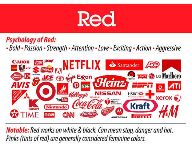
Red is a colour of passion, love, anger, and excitement. It resembles a myriad of signs, from blood, fire, and energy to many others. When it comes to logos, red can be used for multiple purposes.
Whether you’ve got to evoke positive emotions and build perceptions or grab the attention of your viewers, red should be the perfect option with logos for you.
According to psychology, red makes you feel strong and brave – which is why it’s widely used in food-chain industries.
Another popular belief also considers red as the colour of danger. Red stop signs are used all over the world to indicate dangerous situations like fire hazards or power lines.
This is because red stimulates adrenaline production, causing an increase in heart rate. Many businesses use this to their advantage in Marketing.
By incorporating red colour into logos, brands trigger curiosity among people to find exclusive products at low prices.
Red Logo Examples


Orange Logo
Orange represents enthusiasm, fascination, happiness, creativity, determination, attraction, and success.
Compared to other bright colours, the orange is subtle and exhibits warm feelings representing enthusiasm, fascination, happiness, creativity, and attraction.
This colour is also used to symbolise success or achievement in many industries, including business, technology, sports teams, and many others.
However, the orange colour has been associated with youthfulness and produces a positive vibe, like the blossoming spring after dry winter.
Some also believe orange is a colour of creativity, success, and determination, making it an excellent choice for logos with these themes in mind.
Orange Logo Examples
Yellow Logo
As a high-energy colour, yellow evokes happiness, joy, and optimism. It’s the colour of sunshine and is often used to attract attention. It is also the colour of caution, intellect, and beauty.
Yellow Logo Examples

Green Logo
Green is the colour of nature. It symbolises growth, harmony, freshness, and fertility.
As a soothing colour, green is a popular colour choice for logos associated with environmental industries.
Some of the best green logo design examples depict plants or trees in their natural state or growth! Many brands also associate colour with springtime to represent new beginnings throughout all seasons of life.
Green also represents hope for both personal growth and community improvement. In most cases, it brings everything together in one place, so there is no need for conflict between individuals or groups – but it promotes unity.
Green Logo Examples


Purple Logo
Purple combines the stability of blue and the energy of red. The colour is associated with royalty and symbolises power, nobility, luxury, and ambition.
As a bright and vibrant colour, purple inspires creativity in ambitious people or with high goals.
Artists also think of purple as a colour of imagination and creativity.
This is why logos using the colour Purple are often unique and creative. Although it’s a simple colour, purple can still breathe life into any common logo for a sense of luxury.
Purple Logo Examples

Brown Logo
Brown represents nature and earthiness. It is a very versatile colour and can be used in many different ways.
Colour is often associated with the earth, nature, and the fall season. In ancient times, people used to observe brown as a symbol of harvest time.
Brown is a neutral colour that does not stand out on its own much like black or white. However, it still has its place in design because of its extensive use by designers to add depth to their work without overpowering other elements or colours nearby.
Brown also represents reliability and dependability. It’s a colour associated with the earth and is often used in association with food, seen as wholesome, healthy, and natural.
Brown Logo Examples

Black Logo
Black symbolises power and elegance. The colour black has many connotations, but the most common use is to express the absence of colour.
As one of the most sought-after colours, black represents formality, sophistication, dignity, and mystery and is a good choice for a corporate logo. It also works well when there is text on your logo, as it contrasts nicely with white or coloured text.
Black is the king of colours, which can express luxury, authority, or power. In a corporate logo, black shows sophistication and elegance but does not work well with text because it’s harder to read against white backgrounds.
Black Logo Examples

Gray Logo
Gray stands for maturity and responsibility. As a neutral colour, brands often use grey in their logos to represent sophistication, maturity, and responsibility.
However, it’s also one of the most trustworthy colours on earth. If you’re trying to create a logo that turns visitors into loyal customers, grey might be your best bet!
While it is not typically used as the primary colour in logos, it can be a practically supporting element. The use of grey helps create a balance between the other colours in your logo design and can also help create a unique identity for your brand.
Gray Logo Examples

Use of Colour Principle To Decide The Best Logo Colour
If you have never heard of the “colour principle,” it’s high time to learn about this essential psychological rule. According to this, different colours evoke different emotions in people.
This means strategically choosing the best colours to use in your brand’s logo design can help you create strong feelings for your target consumers. However, colour is also an essential element when it comes to communicating a message or telling a story about your brand.
Therefore, most construction companies use bright colours like blue and purple to show that their business is capable of building anything. In short, using resembling colours helps customers identify brands easily and understand what it stands for.
Moreover, the use of colour in logos is also an important consideration to set your brand apart from the competition.
8 reasons logos are important
They hold impactful meaning
Logos can be more powerful when you know what each colour means. When you know the meaning of each colour, you can create a logo that complements your business and convey the brand message. For example, if a logo has the colour red, it’s supposed to ignite fierceness, curiosity, and excitement.
If you’re creating a logo with blue as the main colour, chances are that your logo will pop out and be dominant over other colours. As a result, the audience who will see your logo is likely to mix different ideas and feel connected with the brand.
A rule of thumb is to choose only one colour at a time to prevent confusion among your viewers.
2. Affect emotions
The art of choosing the best logo colours is widely regarded as a science.
Though getting lost in the details can be very easy, you must stick to your goal and create a logo that resonates with your audience.
However, the key to creating a successful logo is understanding how colours affect people’s emotions when they see them on-screen.
3. Sign of identification
For many, the first thing they see when looking at a brand is its logo.
It is a sign of identification and a friendly way to make your customers remember your brand among hundreds of others.
However, you can do a few things to make sure your logo stands out.
- Make sure it is memorable: The key to making a good logo is making it easy for people to recognise and remember.
- If possible, use colours with similar meanings (red means danger; blue means trust). If not possible, choose one colour that represents all three characteristics listed above in this article—a slogan could work here too!
- Make it unique: When choosing colours for your company’s logo, make sure each colour has its distinct meaning within the context of the business itself.
- Add natural identifiers: When it comes to logos, colours are reduced to their emotional, cultural, and psychological components and become identifiers that we associate with brands.
4. Powerful marketing communication tool
Colour is, without a doubt, one of the most powerful tools in a marketing communication to attract eyeballs to your logo or product by changing its colour.
The use of colour in logos is not limited only to branding purposes but also an incredible way to convey meaning through different shades of grey (or black).
Colours can make or break your design. Not only do they help you communicate your brand’s message and vision to the customers, but they also differentiate your brand from others.
5. Create A Unique Identity
Colours in logos also play an integral role in creating a unique identity for your business.
A good example is McDonald’s, which uses red as its primary colour but has yellow, orange, and green featured prominently in the logo.
To create memorable logos, it’s best to use similar shades across all elements of their branding strategy.
6. Connect Emotionally
Each colour is linked with a set of feelings which makes it essential to factor in the impact they will leave on your customers. They have an emotional association that can be used as a guide for how you want to portray your brand.
Red is associated with passion, power, and love. Blue is associated with trust, loyalty, and peace. Yellow is associated with happiness, optimism, and energy. Green represents growth and harmony, while orange signifies creativity and playfulness in the workplace environment.
However, it is important to choose colours that are unique yet memorable. If you are all set to choose colours for your logo, mix& match primary and secondary colours with each other to create something unique.
For this reason, you can look for colour palettes that match the theme and make your logo stick out.
7. Excellent source of communication
A logo is not merely a symbol of your brand but also an excellent means of communication with your target audience.
As a general rule of thumb, create a logo that is simple, eye-catching, and memorable. With the help of your logo, you want to get across a message that reflects the brand as quickly as possible.
8. Communicate your brand’s message
When it comes to choosing the right colours for your brand, there are a few things you need to keep in mind. First, use colours that represent your brand’s personality and vision.
For example, if you’re creating a B2B company that sells products online, use red or orange as its primary colour because these two hues are bolder than any other shades.
Another factor is whether the particular shade would print well on paper (or screen) material. For further assurance, you can check how well each one looks under different lighting conditions before making final decisions about which ones should go into production first.”
Conclusion
Logos are an excellent way to promote your business and express yourself as a separate entity.
Hundreds and thousands of brands use the power of logos on social media platforms like Facebook and Twitter.
That is all for this article. From the best colour logo tips to a few examples of logos that use colours to communicate their brand’s messages, we covered nearly everything here.
We hope this article about “logo examples by colours” has helped you understand how important colours are for your logo design and the tried, tested tips to choose the right ones for your company.


